Apparel Design. Giving an industrial tool a sense of organicness and beauty.
Like the Superbowl, the commercials that run during the Olympics are just as entertaining–with great storytelling and artistic elements. Here are two of my favorites. . .
United Airlines Commercial “Sea Orchestra” by The Black Heart Gang. Wonderful animation. . .
Two b-ball giants: Yao Ming vs. LeBron James in a Coke ad. Fun visual iconography from both American and Chinese cultures without being overly stereotypical and offensive.
This was taken during my trip to the Oakland Zoo.
Apparel design: Experimenting with an urban geometric style.
Simple B+W digital image.
Trying to capture the essence of Hip Hop Freestyle Mcing in a simplified equation. This is also meant to be a promo apparel design for ShaireProductions.
. Art by Sherrie Thai of ShaireProductions.com
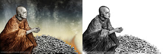
This is the second piece of the Heritage Series I started concerning human atrocities in Asia, particularly the Khmer Rouge–a tribute to my family and to the countless innocent people caught in the crossfire.
The inspiration of this composition was from an old photo (perhaps National Geographic) of an Asian male digging through a pile of bones, looking for the remains of his relatives. What furthered my interest was a photo my friend, Ricky, took while visiting Angkor Wat; it was a simple image of monks looking off into the distance. Merging the two, I came up with this piece. The colors are subdued, with accents on the focal points–the robe and the flames surrounding the bones. The image on the right contains the monotone graphite drawing. I chose not to apply color to the monk’s face to give a sense of humanitarian loss–of being a ghost in a world of struggle and hate.
I’ve contemplated whether I should post this artwork up. As a commercial graphic designer, you are in a constant space of negotiation, seeking approvals, business etiquette, and customer service. With fine arts, it’s based primarily on the artist’s intention, so sometimes, when misunderstood, there is more scrutiny. Throwing caution to the wind, here’s my two cents. . .
About this piece: I’ve always been drawn to political and social art, especially propaganda pieces. Regardless of the society and the context, political art is powerful and many are great works of design. The I Want You Poster and George Orwell’s theme “Big Brother is Watching You” (1984) inspired this piece.
The intention of this is more social than political. The artwork and message is a reminder that society is not as rosey as it may seem–we have to be aware of ourselves and of the world we live in with respect to those around us. Orwell’s words gives the artwork a slightly ominous slant, but just don’t take this too seriously. The presence of eyeballs and the ultra-bright red color lightens the subject matter, making it more approachable in a tongue-in-cheek humorous way. I recreated Uncle Sam in my simplified linework style. Originally intending to create an apparel design, this may have a better life as a poster.


