I was exploring the office building and discovered this mysterious sight. It’s urban and a little mundane, but there’s a quiet beauty. . .
Just exploring a variation of shapes–architectural structures vs. human forms.
Another cloudy day in San Fran.
The MotionGrapher website posed an interesting poll about Shephard Fairey’s infamous Obama poster and Milton Glaser’s critical review. Another critique of Fairey’s work is on artist Mark Vallen’s blog. Earlier, the New York Times published an article, indicating that Fairey’s suing the Associated Press to combat copyright infringement. “The suit asks the judge to declare that Mr. Fairey’s work is protected under fair-use exceptions to copyright law, which allow limited use of copyrighted materials for purposes like criticism or comment.”
I think it depends upon the intention of the artist, whether or not the work is a commentary (falling under fine arts arena) or promotion/advertisement (commercial arts). Public figures are subject to scrutiny and critique–political cartoons and satire are evidence of this–but money always complicates matters. Andy Warhol displayed familiar faces and icons in his work–it was a social commentary on popular culture, but if you look at his commercial work, it was original. With Fairey’s work, he started out in graffiti/street art. Much like the tattoo realm, street arts sometimes take artwork from their original context and places it into a different medium, with or without the original artist’s consent. It’s the nature of the beast and hard to control. From one point of view, it is plagiarism, but in another view, it’s imitation and sometimes viewed as flattery. For fine arts, there shouldn’t be a limitation on creation/expression as it’s personal and an expression of one’s self, but with commercial arts, there should be greater sensitivity to copyrights.
I’ve been a huge fan of Henry Selick without realizing it. He’s the man behind (one of my all-time favs) “The Nightmare Before Christmas” and “James and the Giant Peach.” His latest creation Coraline has been a three-year project shot entirely in 3-D stop-motion animation. Linking up with heavy-hitter Neil Gaiman (fantasy writer who’s film work includes Stardust and Beowolf), the film is as whimsical and endearing as his past work. It’s a beautiful piece of artistry, produced by Oregon-based Laika.
Here are some articles on Henry Selick:
–Oregon Live
–Digital Media FX
–Film Monthly
Happy Valentine’s Day, AKA Singles Awareness Day! I view it as a day of love and thoughtfulness, not necessarily about couples, so have fun!
This illustration was a creative refresh of a Cupid skin in Photoshop and Illustrator. View larger image here.
“Dying for Love” is a goofy visual pun inspired by Valentines Day.
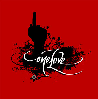
This design is inspired by a phrase in Bob Marley’s song, “One Love”, but expanded to include the text “One Love, One Hope, One Voice.” It’s done in a grungy fashion, and incorporates my urban calligraphy. It’s based on the inclusive attitude of the hip-hop and reggae musical communities. The shirts are available for men and women HERE.
I came across the print shop of MFA Talon Printing in my research for fine art printers. As an artist, this print shop offers great options: serigraph (silkscreen), giclee, and various techniques (gold leaf, UV coating, and metallics). They claim to be the “one of the first fine art printing studios in the country to produce Fine Art Books entirely in silkscreen” but be prepared to stash away some money as they retail for $5,000 to $7,000 for each portfolio book.
. Posted by Sherrie Thai of Shaireproductions.com
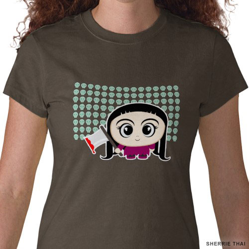
Cartoon Girl with an Axe TEE SHIRT is a fun little project inspired by all those hours of watching animated characters frolic on the screen. Part of my Happy Insanity series, this is also inspired by Emily the Strange, Ruby Gloom, and Happy Tree Friends.
This was first conceptualized in my sketchbook, then went straight to the computer as I had a pretty clear vision–just pure vector shapes in Adobe Illustrator.
Scharffen Berger is one of my FAV chocolates. It was unfortunate to hear the announcement that Hershey’s, its parent company (since 2005), is closing down the original Berkeley plant. Even though times are tough, the design still shines. The site, packaging design, and food photography are all well done–simple elegance.


